Marketing Monday #14 – Mobile Friendly Sites: What That Means and How To Make One
At one point all traffic to websites went through laptops and PCs. However, in recent years the traffic to sites from mobile devices is increasing greatly. I would guess that, eventually, mobile traffic would equal, if not exceed, traffic from laptops/PCs. Do you have multiple devices? If so, which do you use more to search the Internet? With this knowledge, it is wise for you to look into ensuring that your site is mobile friendly also.
Mobile means on the go, therefore many people are on the go when utilizing these devices. The decisions they’re making when browsing from these sites may be as immediate as “do we go to this store or that store right now?” or “is it easy for me to call this business or that business?” The ease in ability to access this information and make these decisions can cost or gain a customer for you.
Mobile friendly sites create a clear, easy experience for the customer. Key aspects of a mobile site are:
- Content clarity: Only include content that is imperative for “on the go” and make it as easy as possible to access. For example, no matter the business, the most important information is your contact information (phone and location), menu/services provided, rates/pricing. Is that information the first thing people can access when coming to your mobile site or do they have to search through to find it?
- The ability to connect directly from your site. By this I mean when a person locates your phone number on the site, they should be able to tap the number and their phone automatically dials the number. When locating the address the site should interact with a map provider to display directions. Your call to action should connect to the device’s email for ease of connection.
- Images are not a valuable use of mobile real estate. While they’re great on your website, they are not providing key information from a mobile device and provide data for people to maneuver around.
With that said, there are a few ways to create a mobile site. The best option for you depends on your budget, time frame and preferences.
- Mobile App – Apps are all the rave and new ones come out all the time. However, it is necessary to have one for your business? Usually, the answer is no. Mobile apps cost a lot of money create, they require a specialized technical team and usually people are not looking for you to have an app, as long as they can get what they need from your site.
- Separate mobile website – You’ve probably seen this when browsing a site and the web address begins with “m”. This is a separate site created specifically for mobile access, which the company has integrated with their main site. Creating a separate mobile site allows you to have a site specifically for mobile; however, there is cost to building and maintaining a separate site. Additionally, it must be highly succinct with your main site, as not to create any confusion amongst your customers.
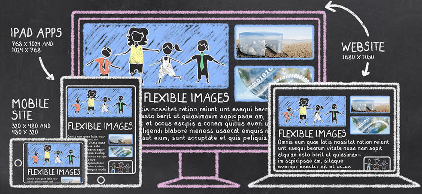
- Responsive design – This is one website that is created with the ability to reorganize and prioritize the data on the site depending on the device accessing the site. We personally believe this is the best option. These sites are SEO friendly, they require one site and no matter the device (there are many device sizes in the market) they are able to adjust accordingly. Our own site is built with a responsive design; access it from a mobile device to see the differences.
Determining which mobile solution to go with can be overwhelming but it doesn’t have to be. Contact us if you have more questions or if you’re seeking a website that is created with responsive design.
